

The React 19 useFormStatus hook is a powerful tool for handling form submissions. In this blog post, we’ll create a reusable SubmitButton with the hook. In addition, it will allow us to create progressively enhanced forms that work even if JavaScript is disabled or the app isn’t done hydrating yet.
Table of contents
Open Table of contents
The Use Case
In our application, we have multiple forms that need to be submitted. We want to create a submit button that can handle the submitting-status and display some feedback, and we want it to be general enough to be used across multiple forms. Spoiler: See the result!
The useFormStatus hook
The useFormStatus hook is a React 19 hook that gives us information about the last form submission.
const { pending, data, method, action } = useFormStatus();It returns an object with the following properties:
pending: A boolean that is true if the form is currently submitting.data: The data that was submitted.method: The method that was used to submit the form.action: The action that was used to submit the form.
See the useFormStatus docs for more information.
It must be used inside a component that is contained in a <form>-element. We will see why this is useful and what benefits it will give us later.
The Starting Point
We have a simple Button-component that we want to build on top of.
export type Props = {
  type?: "button" | "submit" | "reset";
  theme?: "primary" | "secondary" | "destroy";
  children: React.ReactNode;
};

export default function Button({
  children,
  theme = "primary",
  type,
  ...otherProps
}: Props & React.HTMLProps<HTMLButtonElement>) {
  const colorClass =
    theme === "secondary"
      ? "bg-white text-primary disabled:text-gray-dark"
      : theme === "destroy"
        ? "bg-destroy text-white disabled:bg-gray-dark"
        : "bg-primary text-white disabled:bg-primary-dark";

  return (
    <button
      {...otherProps}
      type={type}
      className={cn(
        colorClass,
        "m-0 rounded-lg border-none px-3 py-2 font-medium shadow-sm hover:shadow-md active:shadow-xs active:enabled:translate-y-px disabled:translate-y-px disabled:shadow-xs"
      )}
    >
      {children}
    </button>
  );
}
The SubmitButton - Version 1
We will use the Button-component as a base and extend it with the useFormStatus-hook. Then, when the form is submitting, we will disable it and show a “Submitting…”-text. We also need to make it of type submit. And, we need to make it client component to allow the hook to run on the client side.
"use client";

type Props = {
  theme?: "primary" | "secondary" | "destroy";
  children: React.ReactNode;
  className?: string;
};

export default function SubmitButton({
  children,
  theme = "primary",
  disabled,
  className,
  ...otherProps
}: Props & React.HTMLProps<HTMLButtonElement>) {
  const { pending } = useFormStatus();

  return (
    <Button
      theme={theme}
      {...otherProps}
      disabled={pending}
      type="submit"
      className={className}
    >
      {pending ? "Submitting..." : children}
    </Button>
  );
}
This button is now ready to be used in any form. It will automatically disable itself and show a “Submitting…”-text when the form is submitting.
<form action={submitForm}>
  <input type="text" />
  <SubmitButton />
</form>
The SubmitButton - Version 2
Let’s improve the SubmitButton by adding a loading spinner when the form is submitting, and allow the button to take in children. This way it’s a lot more reusable for any form context. Let’s also allow passing in a loading-prop to trigger loading spinner so it’s even more flexible.
export default function SubmitButton({
  children,
  theme = "primary",
  loading,
  disabled,
  className,
  ...otherProps
}: Props & React.HTMLProps<HTMLButtonElement>) {
  const { pending } = useFormStatus();
  const isSubmitting = pending || loading;

  return (
    <Button
      theme={theme}
      {...otherProps}
      disabled={isSubmitting || disabled}
      type="submit"
      className={className}
    >
      {isSubmitting ? (
        <div className="flex items-center justify-center gap-2">
          {children}
          <div className="h-fit w-fit animate-spin">
            <SpinnerIcon
              width={16}
              height={16}
              className={
                theme === "secondary" ? "text-gray-dark" : "text-white"
              }
            />
          </div>
        </div>
      ) : (
        children
      )}
    </Button>
  );
}
This button is now more reusable and flexible. It can be used in any form, and it will show a loading spinner when the form is submitting. It can also take in children, so you can customize the button text.
<form action={createRecord}>
  <input type="text" />
  <SubmitButton>Save</SubmitButton>
</form>
The SubmitButton can be thrown into any component without forcing us to make separate client components to handle submission state.
Bonus: the form is progressively enhanced, so it will work even if JavaScript is disabled, and it will show the feedback when the button is hydrated.
This is already good, but let’s take it a step further. We can actually use this to make progressively enhanced buttons all around our application!
The <form /> Component and Server Actions
With the introduction of React 19’s <form />-component, we can bind a form to a sever action. This will allow us to create progressively enhanced forms. If JavaScript is disabled or hasn’t hydrated the form yet, it will still work as expected. However, it won’t show the feedback that we use JavaScript to display.
To maintain progressive enhancement across different use cases, we should know about the following techniques:
- Use forms with actions instead of buttons with onClick-handlers.
- Use the
.bindfunction to pass initial arguments to a server action. - Use hidden inputs to pass data to the server action.
This pattern is commonly seen in Remix applications, but we can use it in Next.js with React 19 as well.
Progressively Enhanced Buttons
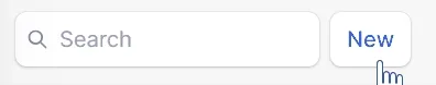
Let’s say we have a button to create a new record:
"use client";

export default function NewRecordButton() {
  const [isPending, startTransition] = useTransition();

  return (
    <Button
      theme="secondary"
      onClick={() => {
        startTransition(async () => {
          await createEmptyRecord();
        });
      }}
      disabled={isPending}
      type="submit"
    >
      {isPending ? "Creating..." : "New"}
    </Button>
  );
}
We’re using a transition because we want to disable the button and display text feedback when the action is underway. This is a common pattern in React 19 applications.
Problem is, this requires the component to be hydrated to work. We can improve this.
Instead of using buttons with onClick-handlers, we can use forms with the SubmitButton-component.
'use client';

export default function NewRecordButton() {

  return (
    <form action={createEmptyRecord}>
      <SubmitButton theme="secondary">New</SubmitButton>
    </form>
  );
The SubmitButton will automatically disable itself and show the spinner when the form is submitting. This will work even if JavaScript is disabled or hasn’t hydrated the form yet!
And actually, this doesn’t need to be a separate component anymore! We can put the content back into whatever component it is being used in directly, even async server components.
export default async function Page() {
  const contacts = await getRecord();

  return (
    ...
      <form action={createEmptyContact}>
        <SubmitButton theme="secondary">New</SubmitButton>
      </form>
    ...
  );
}
Furthermore, when we need to pass additional data to the server action, we can use the .bind function:
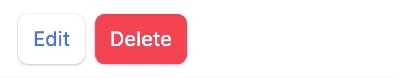
export default function Component({ contactId }: { contactId: string }) {
  const deleteRecordById = deleteRecord.bind(null, contactId);

  return (
    <form action={deleteRecordById}>
      <SubmitButton theme="destroy">Delete</SubmitButton>
    </form>
  );
}
export async function deleteContact(contactId: string) {Or hidden inputs and get the contactId from the FormData in the server action:
export default function Component({ contactId }: { contactId: string }) {
  return (
    <form action={deleteRecord}>
      <input type="hidden" name="contactId" value={contactId} />
      <SubmitButton theme="destroy">Delete</SubmitButton>
    </form>
  );
}
export async function deleteContact(formData: FormData) {
const contactId = formData.get('contactId');And we can add additional client-side login to the forms’ onSubmit if needed. Like an alert dialog or optimistic updates, see my previous blog post for examples of this.
The Result
Smooth.

See the app and the full code where I have implemented the patterns mentioned in my Remix Contacts Rebuild V2 GitHub repo.
Conclusion
In this blog post, we created a reusable SubmitButton with useFormStatus. We also saw how we can create progressively enhanced forms and buttons that work even if JavaScript is disabled or the page isn’t hydrated. This is a powerful pattern that can be used in any SSR React 19 application.
Please let me know if you have any questions or comments, and follow me on X for more updates. Happy coding! 🚀